
Set up widget settings for Ad Hoc Table Widget
1. Click on the widget to activate the widget menu and click the  button to open widget settings.
Please note: Ad Hoc Timeline widget settings are presented on 9 tabs, such as Title, Columns, Format, Timeline Format, Colors, Scrolling, Lines, Misc, Timeline. All these settings allow to configure the view of the widget.
2. On the Title tab define the Title parameters:
a) Check the Show Title checkbox if you want to see the title in the widget.
b) In the Widget Title section enter the name of the widget.
c) In the Color section select the color of the title.
d) In the Font Size section choose the size of the title.
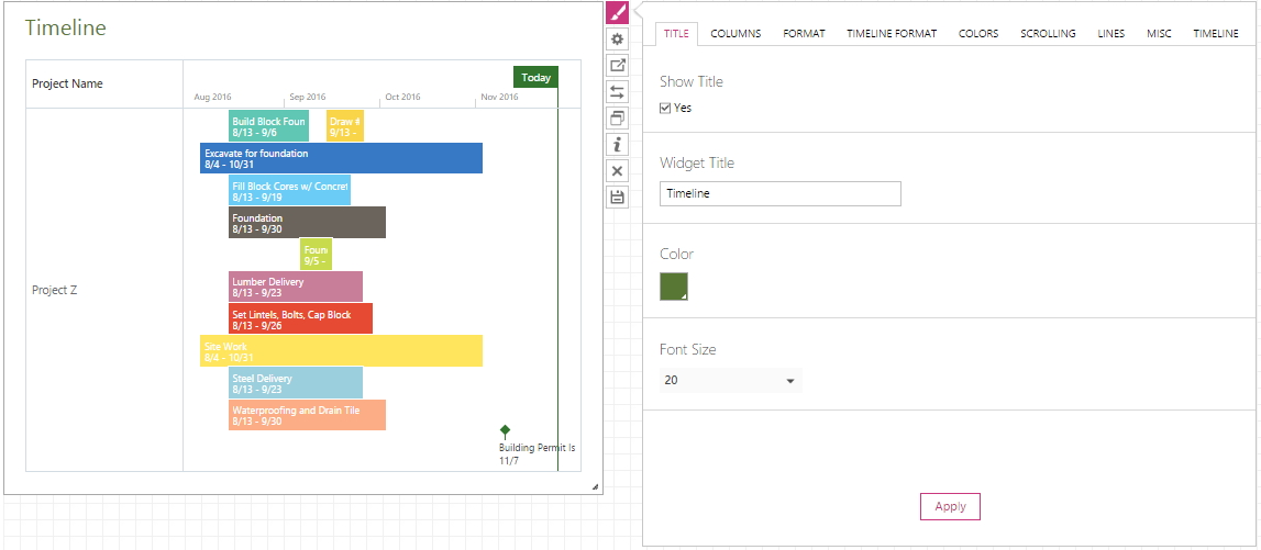
Click the Apply button to apply the changes to the widget.
3. On the Columns tab define the Headers parameters:
a) Check the Hide Headers checkbox if you want to hide the headers.
b) In the Headers section enter the names of the headers, separating them with commas, if you need to change them.
c) In the Width section define the width of the columns under each header. Percentage or pixels can be used to define this parameter. If you need to define the width in several columns, separate the numbers with commas.
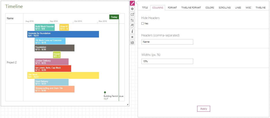
Click the Apply button to apply the changes to the widget.
4. On the Format tab you can define the look of the cells and the style of the font. The formatting rule can be applied to All columns, Header, Footer, and first 10 Columns of the table. You can add as many rules, as you like. The position of the rule defines its priority – the higher rule is, the higher priority it has.
- In the Column / Raw cell choose which column or raw you would like to change the text.
- Alignment option defines the text position in a cell.
- You can adjust the Font Size in the corresponding option.
- In the Font Style option you can choose, the font will be in bold, italics or underlined.
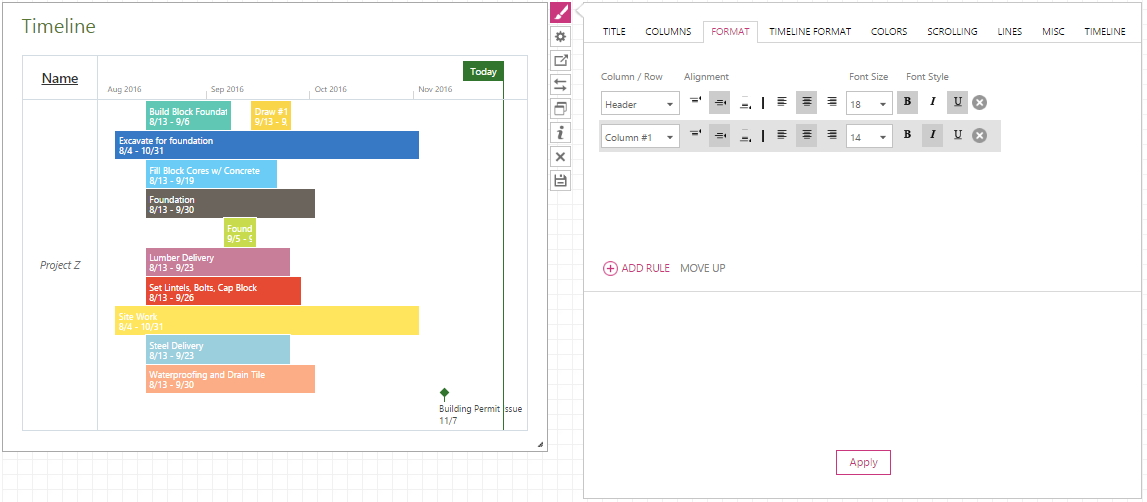
Click the Apply button to apply the changes to the widget.
5. On the Timeline Format tab define the look of the timeline. On the Timeline Format tab, if needed, you can create one or multiple rules and set up the rule style to be applied to the timeline cells that qualify the rule conditions.
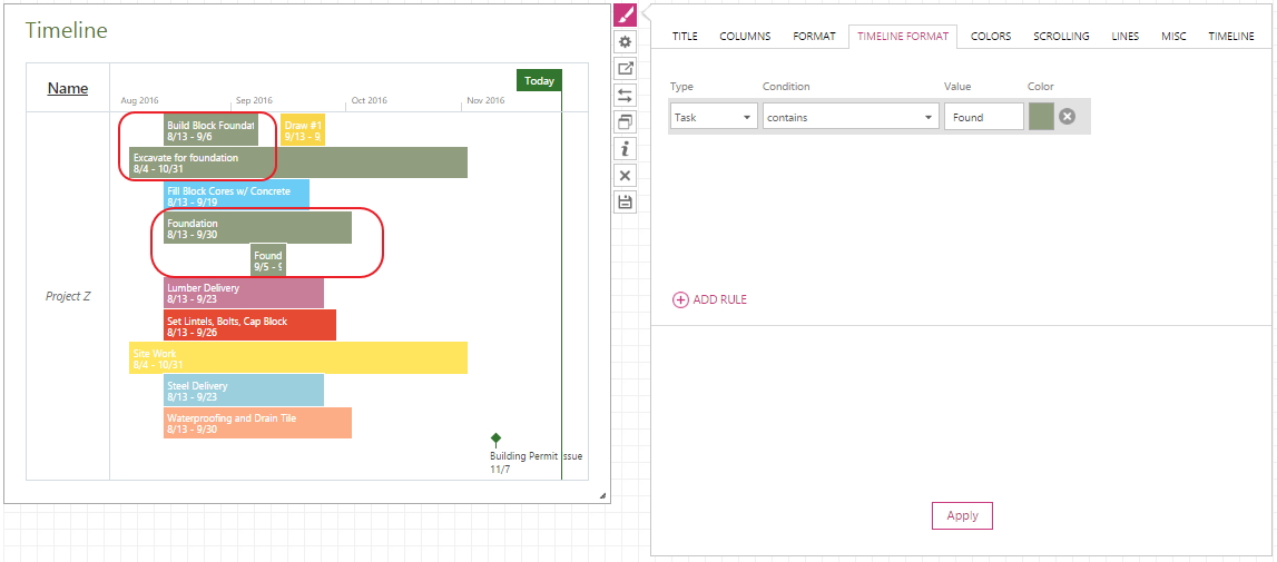
Click the Apply button to apply the changes to the widget.
6. On the Color tab you can choose colors for fonts and cells of your table. Color rules can be applied to All columns, Header, Footer, and first 10 Columns of the table. You can add as many rules, as you like. The position of the rule defines its priority – the higher rule is, the higher priority it has.
- In the Column / Raw cell choose which column or raw you would like to change the color.
- Condition option allows defining condition for the rule. Among available conditions there are contains, does not contain, contains exactly, is any value, and matches regex.
- Define Condition in the corresponding option, unless you have chosen is any value.
- In the Icons option you can choose any of the available icons to be displayed or just leave text.
- BG and Font will allow choosing colors for background and font correspondingly. You can either choose any of the available colors or type in the #RGB value.
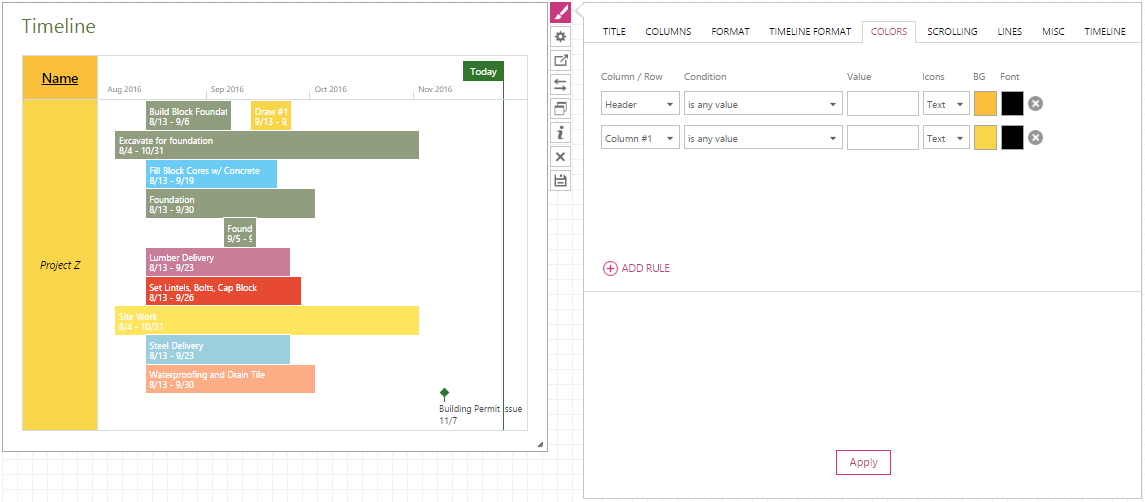
Click the Apply button to apply the changes to the widget.
7. On the Scrolling tab select the fields that you need to distinguish.
a) Check the Fix Leading Columns checkbox if you need to disable formatting of the table cells in the widget.
b) Check the Enable Scrolling checkbox to apply the scrolling option.

Click the Apply button to apply the changes to the widget.
8. On the Lines tab define the view of the lines and borders in the widget.
a) Check the Show Table Borders checkbox if you need the borders to be displayed in the widget.
b) Check the Show Horizontal Lines checkbox if you need the horizontal lines to be displayed in the widget.
c) Check the Show Vertical Lines checkbox if you need the vertical lines to be displayed in the widget.
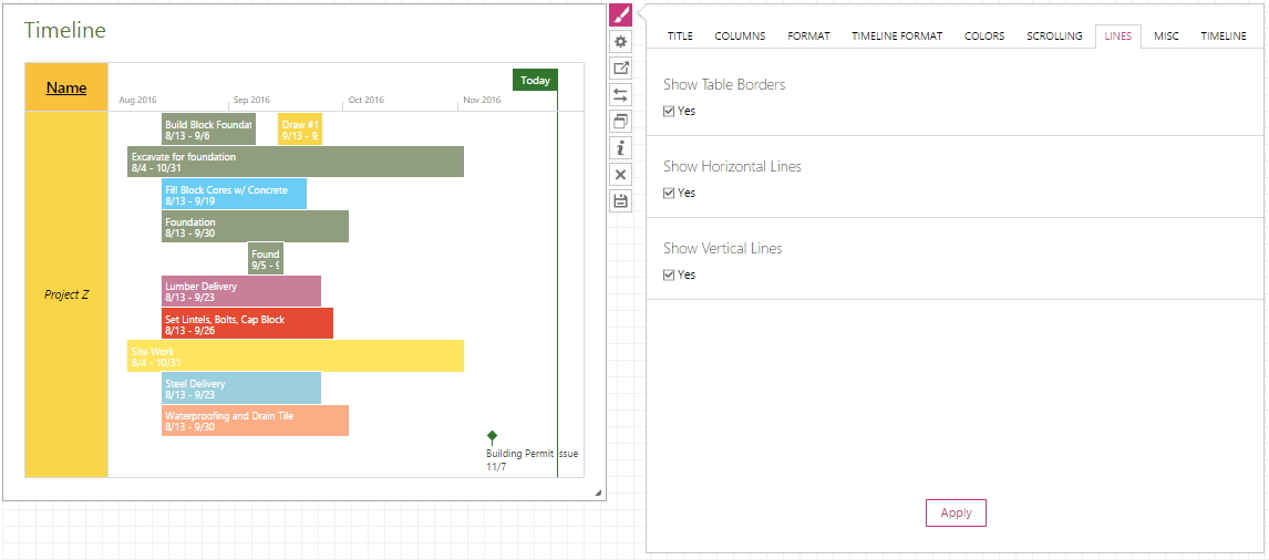
Click the Apply button to apply the changes to the widget.
9. On the Misc tab define the view of the borders in the widget and the sizing of the widget in the dashboard.
a) Check the Show Borders checkbox if you need the borders of the widget to be displayed.
b) In the Sizing section you can select the sizing type Static or By Content (View mode).
Please note: If you select the Static type, the widget will be displayed in the size that you have chosen, after saving the dashboard.
Please note: If you select the By Content option, then the widget will change the size, after you save it as a dashboard, automatically, depending on the content of the widget.
 Click the Apply button to apply the changes to the widget.
 10. On the Timeline tab define the view of the timeline.
a) In the Timeline section define a time period for time-phased information displayed.
b) Check Display Current Day checkbox if you need the current day to be displayed.
c) Check Display Milestone Titles checkbox if you need milestone titles to be displayed.
d) Check Allow Overlap checkbox if you need the the tasks sections to overlap.
e) Check Narrow Lines checkbox if you need to narrow tasks sections.
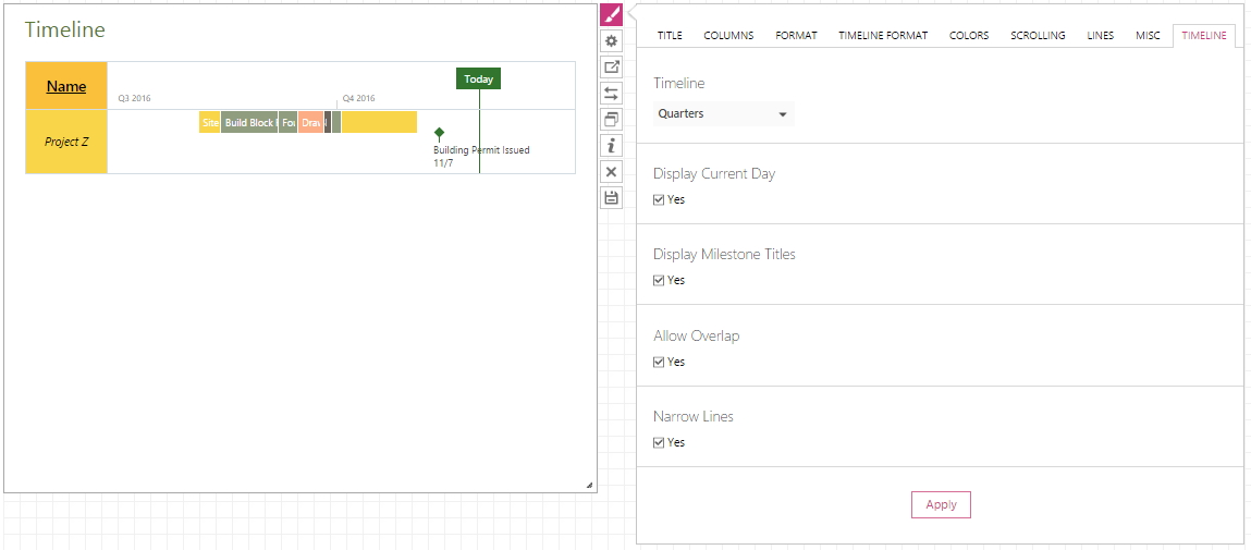
Click the Apply button to apply the changes to the widget.