Set up widget settings for Ad Hoc Chart Widget
The following setting allows you to apply additional changes to your ad hoc widget.
Please note: Ad hoc chart widget settings are presented on 7 tabs, such as Title, View, Legend, Labels, Axes, Colors, and Misc.
Please note: To check out the changes, please click Apply button.
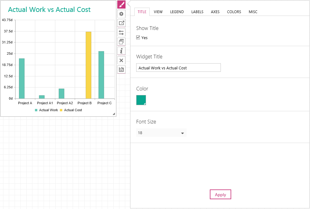
1. Click on the widget to activate the widget menu and click the  button to open widget settings. 2. On the Title tab define the Title parameters:
a) Check the Show Title checkbox if you want to see the title in the widget.
b) In the Widget Title section enter the name of the widget.
c) In the Color section select the color of the title.
d) In the Font Size section choose the size of the title.
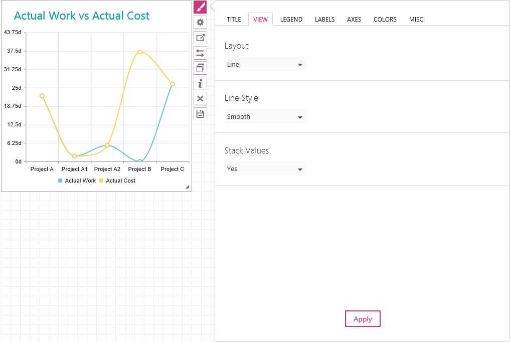
3. On the View tab define the style of layout items.
a) In the Layout section select the view of the widget: Horizontal bars, Vertical Columns, Line, Area or Pie.
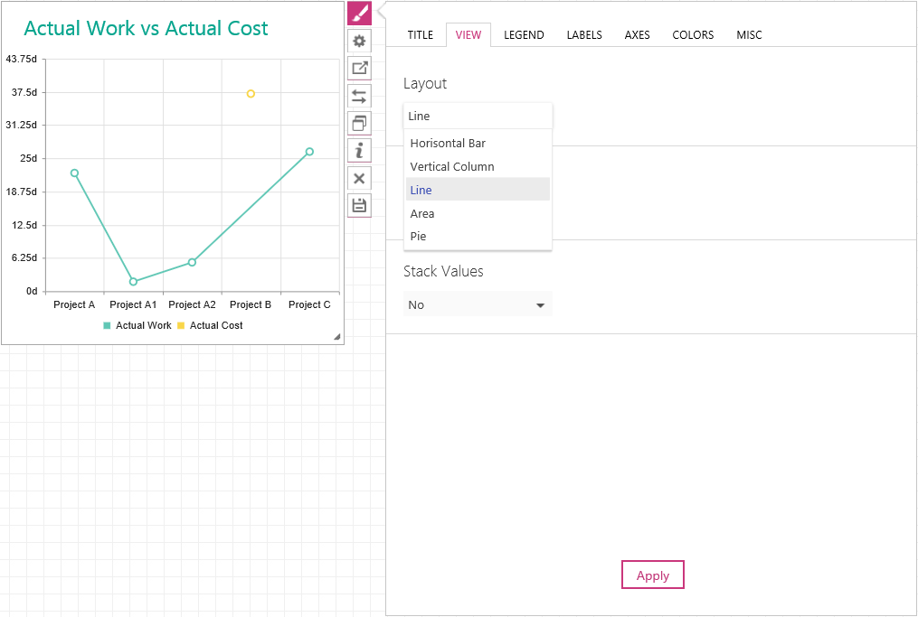
b) In the Line Style section choose the visualization method – Normal, Step and Smooth.
c) If you would like your columns to have the stacked view, choose Yes in Stack Values.
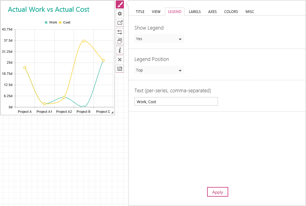
4. On the Legend tab define how the information on layout items of your widget would be displayed.
a) In the Show Legend section select Yes to show the legend, or select No to hide it.
Please note: If Auto is chosen the legend will be shown.
b) In the Legend Position section select if the legend should be displayed – on Top, in the Bottom, on the Left and on the Right.
c) In the Text section define the text of the legend, if that is necessary. Type the text accordingly, separating it with commas.
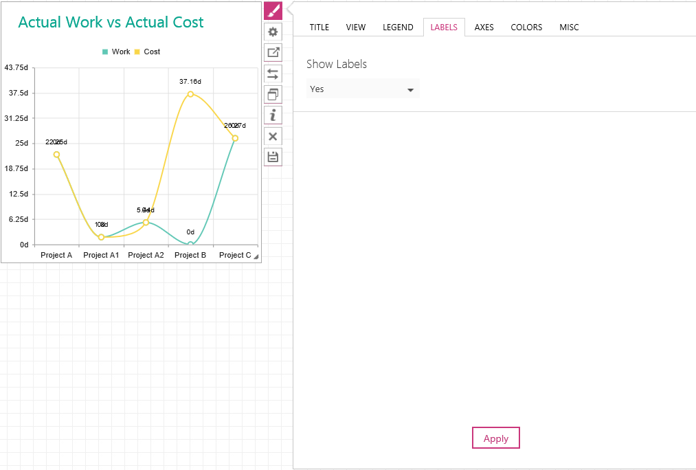
5. On the Labels tab define if the labels in the widget should be shown or hidden.
Please note: If Auto is set up, the labels will not be visible.
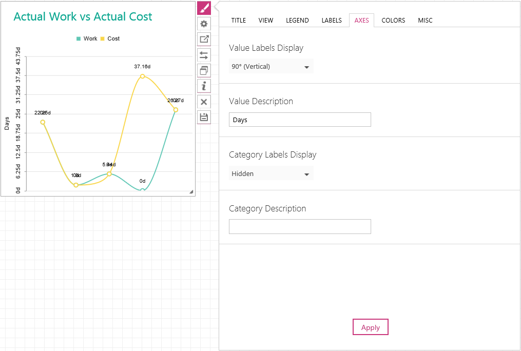
6. On the Axes tab define the way axes should be visualized.
a) In the Value Labels Display section select the rotation of the value labels. In this section you can also choose to hide the axes.
b) In the Value description section type description of the value labels in case it is necessary.
c) In the Category Labels Display section select the rotation of category labels or hide them.
d) In the Category description section type description of the category labels in case it is necessary.
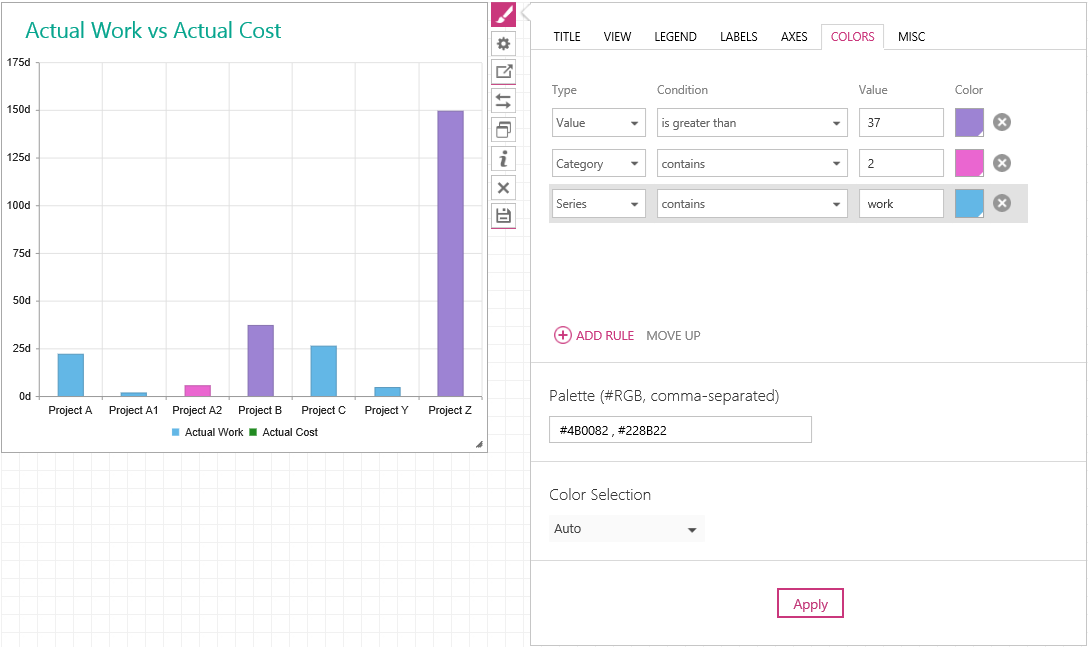
7. On the Colors tab define the look of the chart.
a) In the Palette section write down the colors, which you would like to see correspondingly, comma-separated. You can either write down the typical colors or use the #RGB names.
b) In the Color Selection define the way how the specified colors should be applied per series or per value.
Please note: If Auto is selected, the selection per series will apply.
Please note: If Per Value color selection is chosen no legend would be shown.
If you would like to apply color to your items according to specific rule, you can set up Filter settings. To do that:
- Choose the type of data to which the rule will be applied – Category, Series or Value;
- choose conditions – several options are available, some of them are applicable for numeric data, some to alphabetic (e.g. ‘is greater’ – numeric information; ‘contains’ – alphabetic);
- depending on the chosen condition, type in the value for the filter;
- select a color from those available or type in #RGB one.
Please note: This filter has priority over the ‘Palette’ settings.
Please note: The priority of each rule depends on its position. After creating a rule, you can move it up or down.
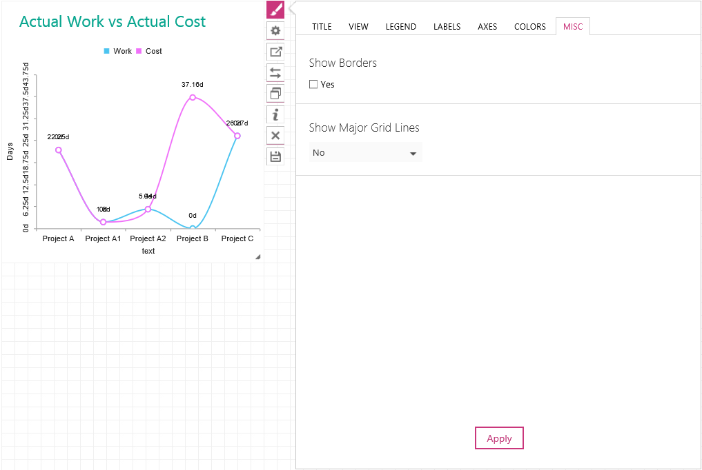
8. On the Misc tab define the widgets borders and grid lines. a) In the Show Borders section hide or show the outer borders of the widget. Check the checkbox for visible borders, uncheck it to make them invisible.
NOTE: If the checkbox has thestate, the borders visibility will depend on your dashboard Properties settings. The dashboard Properties will define the visualization of all widgets in this dashboard. If you would like this particular widget to have another setting - use the Misc tabShow Borders setting.
b) In the Show Major Grid Line section hide or make grid lines in the widget visible.
Please note: If Auto is selected, grid lines will be visible.