
Widget Settings allow to change widget's look and feel by changing its title, font size, font color, layout, etc.
To access Settings click on the widget to activate the widget menu and click the  button.
The set of available settings usually differs depending on the Widget Type, in this article we will describe all existing settings.
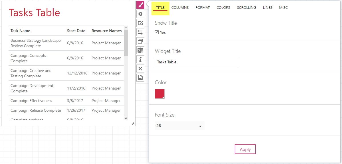
Title
In this tab you can change the looks of widget title.
- Show Title checkbox regulates whether the title is visible or not
- In the Widget Title field you can specify your own title for your widget or even leave it blank
- Color section allows to change the title font color
- Font Size accordingly will allow you to choose the title font size
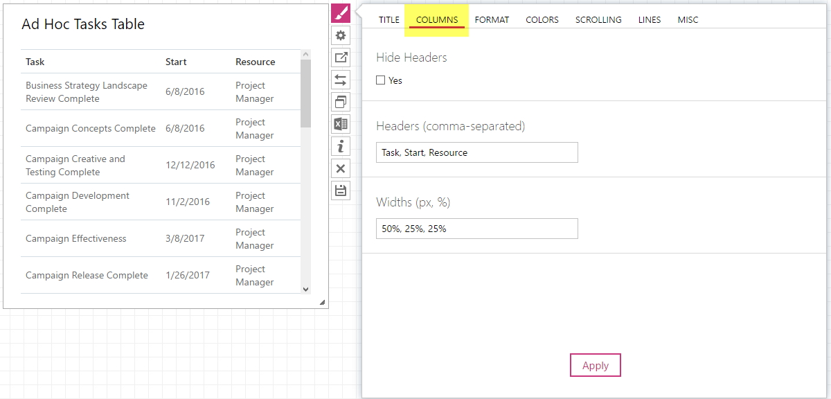
Columns
- Hide Headers checkbox regulates whether the column headers are visible or not.
- Headers (comma-separated) - in this field you can set the names of the columns you like. As per instruction, print the names comma-separated.
-
Width (px, %) - define the desired width of the columns under each header. Percentage or pixels can be used to define this parameter. If you need to define the width for several columns, separate the numbers with commas.
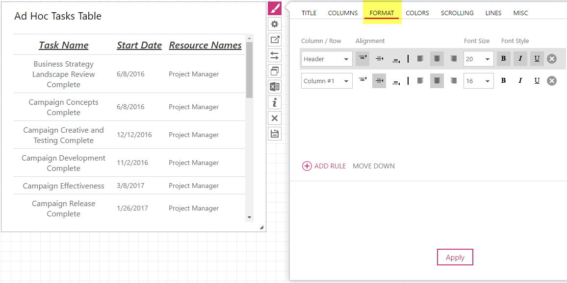
Format
On this tab you can define look of the cells and the font style.
- In the Column / Row field specify, which part of the table you would like to alter - All, Header, Odd Rows, Even Rows, Footer and first 10 Columns of the table may be selected here.
- Choose the desired text Alignment in the cell - Top, Middle or Bottom. Also, it can be set to Left, Center or Right.
- The Font Size and Font Style settings are also available on this tab.
You can add as many rules, as you like. The position of the rule defines its priority – the higher the rule is, the higher priority it has.
Colors
Here it is possible to choose colors for fonts and cells in your table.
- In the Column / Row field specify, which part of the table you would like to alter - All, Header, Odd Rows, Even Rows, Footer and first 10 Columns of the table may be selected here.
-
Condition field allows to define condition for the rule. Among available conditions there are contains, does not contain, contains exactly, is any value and matches regex.
Define Condition or leave is any value if needed. - Value must be specified in the corresponding field, unless is any value was chosen.
- It is possible to choose an Icon to be displayed instead of text, if the value matches condition. A great variety on indicators, pointing errors, etc. of different colors is available as icons.
- In BG and Font fields choose the color you would like to see as a column / row background or text correspondingly. You can either choose any of the available colors or type in the #RGB value.

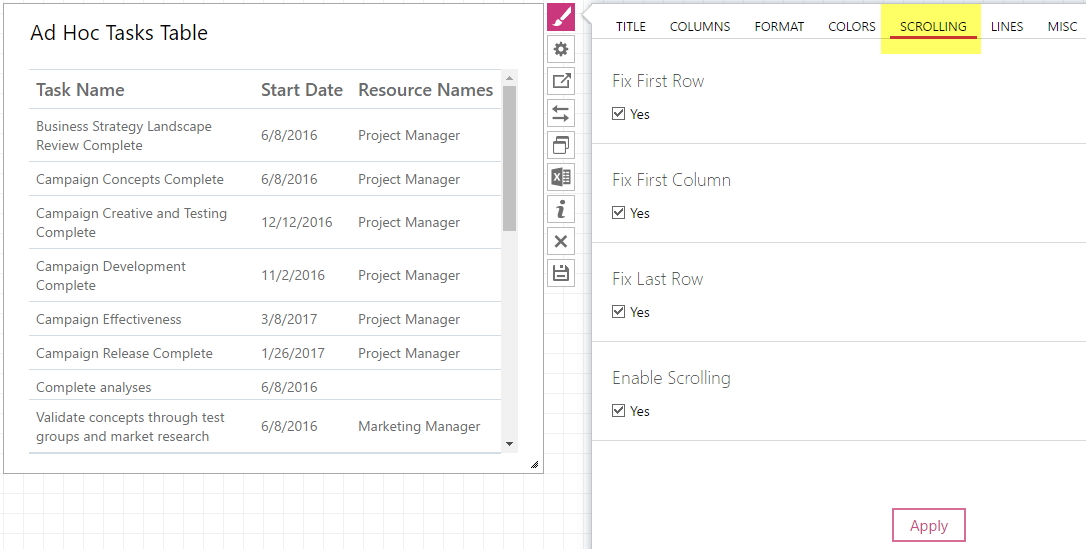
Scrolling
- Check the Fix First Row checkbox if you need to fixate the first row when scrolling or to highlight the first row, if you do not enable scrolling.
- Check the Fix First Column checkbox if you need to fixate or highlight the first column.
- Check the Fix Last Row checkbox if you need the last row to be seen without scrolling down or to be highlighted, if you do not enable scrolling.
- Check the Enable Scrollingcheckbox to apply or disable the scrolling option.
Lines
Here the view of the lines and borders in the widget can be defined.
- Check the Show Table Borders checkbox if you need the borders to be displayed in the widget.
- Check the Show Horizontal Lines checkbox if you need the horizontal lines to be displayed in the widget.
- Check the Show Vertical Lines checkbox if you need the vertical lines to be displayed in the widget.

Misc
On this tab define the view of the borders in the widget and the sizing of the widget in the dashboard.
- Check the Show Borders checkbox if you need the borders of the widget to be displayed. If the checkbox has the square mark, instead of a checkmark, the visibility of the borders will depend on your dashboard Properties settings. The dashboard Properties will define the visualization of all widgets in this dashboard. If you would like this particular widget to have another setting, check or uncheck this option correspondingly.
- In the Sizing section, you can select the sizing type Static or By Content (View mode). If you select the Static type, then after saving the dashboard widget will be displayed in the size that you have set. If you select the By Content option, then the widget will change the size, after you save the dashboard automatically, depending on the content of the widget.

View
This tab defines the style of layout items.
- In the Layout, section select the view of the widget: Horizontal bars, Vertical Columns, Line, Area or Pie.
- In the Line Style section choose the visualization method – Normal, Step or Smooth.
- If you would like your columns to have the stacked view, choose Yes in Stack Values.

Legend
This tab defines how the information on layout items of your widget would be displayed.
- In the Show Legend section select Yes to show the legend or select No to hide it. If Auto is chosen the legend will be shown.
- In the Legend Position section select where the legend should be displayed – on Top, in the Bottom, on the Left, or on the Right.
- In the Text section, you can define your own text for the legend if that is necessary. Type the text accordingly, separating it with commas.

Labels
This tab allows to control the labels view:
- In Show Labels field choose, whether you want to display labels or - choose Yes or No correspondingly. If Auto is chosen, labels will be hidden.
- Here you can also choose the Label Position between Auto and Center. If Auto is chosen, labels will be displayed on top of the bars. With the Center setting, labels will be placed inside the bar.

Axes
On this tab, you can make changes to the way axes are being visualized.
- Value Labels Display option allows rotating the value labels, which would be helpful for widget size adjustment. In this option you can also choose to hide the axes.
- With the Value Description option you can add a description to your axes.
- Category Labels Display option defines the way how category labels would be displayed for your widget. You can choose to hide the labels or rotate them so that they correspond to the best of your taste.
-
Category Descriptionoption is to add a description to your legend if you need one.

Formatting
- Check the Original checkbox if you do not need the Formatting settings to be applied to the widget.
- In the Font Color section select the color of the data presented in the widget.
- In the Font Size section select the size of the data displayed.

Alignment
On this tab define the position of the data in the widget.
- In the Horizontal section choose where the data should be displayed: on the Left, on the Right or in the Center.
- In the Vertical section choose the position of the data (Top, Middle or Bottom).

Layout
Here you can define the presentation of the data displayed in the widget.
- In the Shape section select the background of the widget if needed. It can be a Circle or a Rectangle. Select None if you do not need any background.
- In the Shape Colorsection select the color of the background.

Timeline Format
On the Timeline Format tab, if needed, you can create one or multiple rules and set up the rule style to be applied to the timeline cells that fall under the rule conditions.
Timeline
In this tab you are able to change the view of your timeline.
- In the Timeline section define a time period for time-phased information displayed. These can be Days, Weeks, Months, Quarters, Years, and Auto. If Auto is chosen, the timeline will be shown in quarters.
- Check Display Current Day checkbox if you need the current day to be marked on the timeline.
- Check Display Milestone Titles checkbox if you want milestone title to be displayed.
- Check Allow Overlap checkbox if you need the the tasks sections to overlap.
- Check Narrow Lines checkbox if you need to narrow tasks sections.
